What’s common among chocolate brands like Cadbury, Mars, Ferrero Rocher, Toblerone, and Lindt? These best chocolate brands have unique logos and brand identities! Mere a look at the logo is enough to know about their quality chocolates.
The chocolate market is growing rapidly. The revenue generated by chocolate confectionery market is expected to reach 316.3 billion dollars in 2028. (Source Statista).
The arrival of premium brands has made the industry even more competitive. Consumers are eager to pay more for quality chocolates. That’s the reason the industry is seeing a surge in independent brands offering quality sweet treats.
So if you’re planning to launch your own chocolate brand, here’s a list of the famous chocolate brands and their logos to help you out.
Top 15 chocolate brands with inspirational logos.
Before you create a logo for your chocolate brand, go through some inspirational logo design ideas. Here are the famous logos from our list:
01. Cadbury
Cadbury is an ideal example of chocolate logo ideas. The British brand has a distinct identity that consumers can easily relate to. Founded in 1824 by John Cadbury, the company is one of the best chocolate brands in the world.
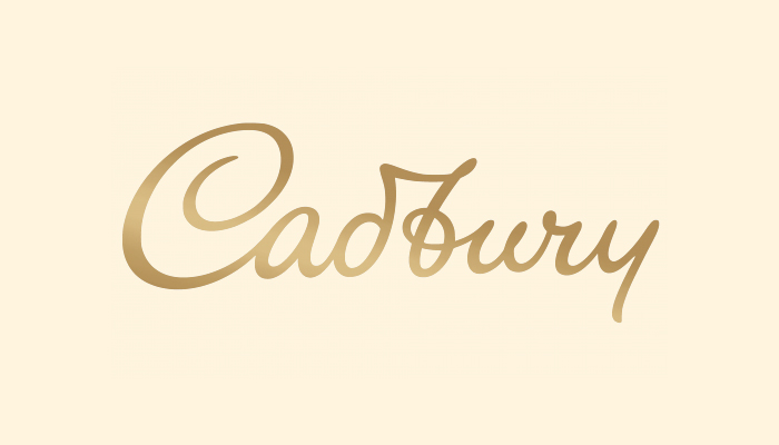
A single glance at its logo is enough to remind its products like milk chocolates, chocolate-filled fruits and nuts bars, and mini crème eggs.
What’s unique about Cadbury logo?
- Custom cursive font that adds to its signature style.
- Purple and gold color scheme gives a sense of luxury.
- The overall logo design exudes warmth and authenticity.
02. M&M
The M&M logo design is innovative and shows how the creative use of letters helps create a unique monogram design. This logo explores sans serif font in lowercase letters to build a unique brand identity. Its logo has its company’s name in bold and brown font, which resembles the color of chocolate. The logo image has remained the same over the decades.
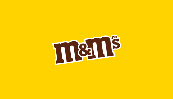
The “&” placed between the letters creates a fun-filled aesthetic. Started in 1941, the brand is still active with its dominant logo.
What’s unique about M&M logo?
- The bold serif font creates a unique identity.
- The chocolate color palette paired with white and yellow depicts warmth, fun, and authority.
- The “&” placed between the letters gives it a unique look.
03. Milka
Milka is one of the best chocolate brands in the world. The Milka logo is another excellent example of how merely using two colors, and one font style is enough to look impressive and unique. It uses a soft cursive script font to convey the smoothness of the chocolate melting in the mouth. The font styles also evoke the comforting texture of the brand’s chocolates. The brand uses lilac color, which is its identity.
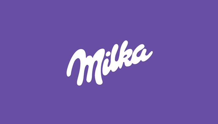
Its logo design is flat, which makes it easy to use across all marketing and advertising channels. The cursive letters look even more attractive in white against the lilac background. Milka is another leading chocolate brand produced by Mondelez International.
What’s unique about Milka logo?
- The logo uses a soft script font to show its brand name.
- The lilac and white color combination is striking.
- The company logo reflects warmth, exclusiveness, and friendliness.
04. Ghirardelli
Ghirardelli is amongst the biggest and oldest chocolate brands in the US. Established in 1882, Ghirardelli Chocolate Company makes premium chocolates known for their smooth texture and intense flavor.
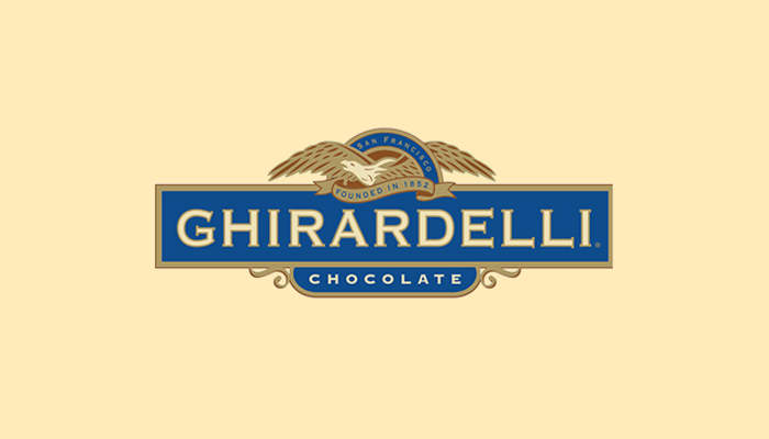
Its logo features the brand name with ‘Chocolate’ mentioned in a classic enclosure underneath. However, the golden eagle, which is widespread at the top of the brand name, is the chief feature of the logo design. The eagle symbolizes authority, freedom, and excellence. It also highlights the historical significance of the brand, which was established in 1852.
The logo text is in all capitalized letters of the brand name to express its authority in the market. Such lettering also helps drive customers’ attention.
What’s unique about Ghirardelli logo?
- A unique layout, which features an eagle at the top, symbolizes freedom.
- The blue and golden color palette exudes trust, credibility, and authority.
- The sans serif font signifies the brand’s long presence in the market.
05. Hershey’s
Hershey’s logo is an excellent example of creating an emblem with letters only and still making it look different. The company’s logo is a wordmark, displaying the brand name in a bold sans-serif typeface in chocolate color.
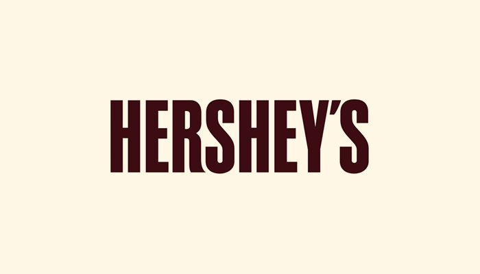
The logo is rectangular due to the large letters. However, it is a simple logo design with no other elements incorporated. Such a logo design helps in evoking consumers’ trust in the brand. It also expresses the authority of more than a century-old brand.
The company started in 1889 when Milton & Hershey established this American company for mass chocolate production. The company’s products, such as Hershey’s Milk Chocolate bars and Reese’s Peanut Butter Cups, are popular with chocolate lovers.
What’s unique about Hershey’s logo?
- The chocolate brand’s logo is in a custom Milton font named after its founder, Milton.
- The logo showcases simplicity, and the brown color reminds of chocolates.
- The logo is simple and straightforward and sticks to the mind easily.
06. Kinder
Some logos make a lasting impression due to their unique use of colors. The Kinder logo is an outstanding example of such a design. Kinder is an Italian chocolate brand known for its fun-filled, child-friendly offers, such as Kinder Surprise, Kinder Joy, and Kinder Bueno. Kinder is a division of Ferrero, the giant Italian confectionery company.
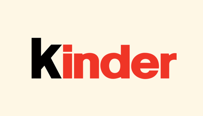
Its red and black logo makes it a unique design that stands out from its competitors’ logos. The first letter ‘k’ is black, and the rest of the brand name is bright red.
Black works as the color of authority, which conveys that the brand is a leading chocolate maker in the Italian and global markets. The red evokes passion and energy for the chocolate lovers.
What’s unique about Kinder’s logo?
- A unique black and red color combination sets this logo apart from others.
- The simple serif font makes it legible.
- The logo’s color scheme makes it convey a sense of authority, passion, and energy.
07. Snickers
Snickers is a famous chocolate brand with worldwide consumer appeal. The brand is known for its various chocolate blends, such as peanut, milk, caramel, and nougat.
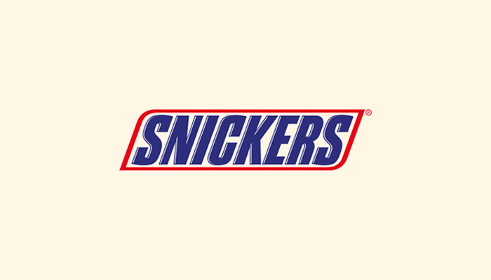
The logo has the brand name in heavy serif font in capitalized letters. The letters are also in solid blue to convey the chocolate’s robust and satisfying flavor.
A red and white border encasing the brand name makes this chocolate logo design stand out.
The boundaries give the logo a dynamic and sporty look.
What’s unique about Snickers’ logo?
- The use of the blue, white, and red color combination conveys reliability and strength of the brand.
- Contrasting color scheme with serif font stands out.
- The layout is simple and legible that customers can recognize with ease.
08. Lake Champlain Chocolates
Are you planning to design a logo that can evoke your brand’s authenticity and consumers’ trust? The Lake Champlain Chocolates logo is the example you can follow. This brand was established in 1983 to make small-batch handcrafted chocolates.
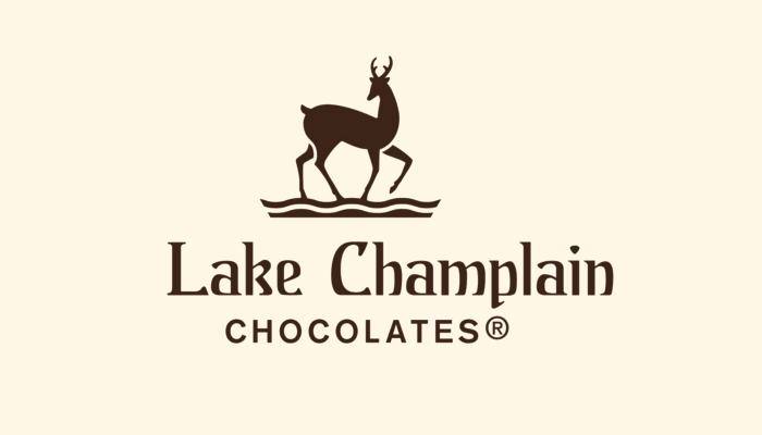
The chocolate brand logo includes a deer standing over water waves. The inclusion of the deer in the logo symbolizes the nature and freshness that the brand’s chocolates are known for. The timeless serif font showcases the brand name in a classic manner, while the brown color scheme talks volumes about the brand’s authentic chocolates.
What’s unique about Lake Champlain’s logo?
- The inclusion of deer in the logo create a friendly brand image.
- The serif font showcases the timelessness of this brand.
- The brown color scheme symbolizes the brand’s high-quality chocolates.
09. Kit Kat
Kit Kat logo design is another example of simplicity at its best. This is an iconic red and white logo that people can recognize immediately. The designer used the typography to build the chocolate brand’s unique identity. You can notice that the letter ‘k’ appears enlarged over other letters. That gives the logo and its brand an unforgettable identity.
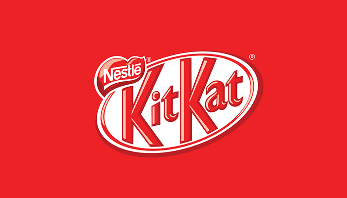
Red is the color of passion and energy, targeted at young consumers. The striking white oval background also makes the design memorable.
- The striking red and white color combination gives the chocolate logo a refreshing and energetic look.
- The classy sans serif font makes the logo stand out.
- The enlarged “K” letter gives the brand a unique identity.
10. Lindt
This Swiss chocolate brand is famous for transforming chocolate creation with its innovative conching process. This helps them create chocolates that are smoother and richer in taste.
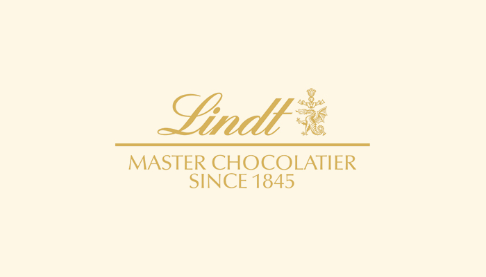
The Lindt logo features the brand name in elegant script typeface that signifies its premium chocolates. Just below the brand name appears “Master Chocolatier Since 1845” that symbolizes the brand’s chocolate-making prowess. On the right, a dragon symbol stands for its craftsmanship and heritage.
This chocolate logo is an inspirational example of a simple design. It has just one golden color, which has become its brand identity. The italicized calligraphy expresses the melting flow of the brand’s chocolate.
What’s unique about Lindt’s logo?
- The script font used in the logo symbolizes elegance and melting flow of the chocolate.
- The golden color scheme stands for its premium status and quality chocolates.
- The dragon symbolism in the logo conveys the brand’s heritage and craftsmanship.
11. Butterfinger
Butterfinger is another prominent chocolate brand established in 1923 by the Curtiss Candy Company. Its logo is a remarkable design that features only the brand name.
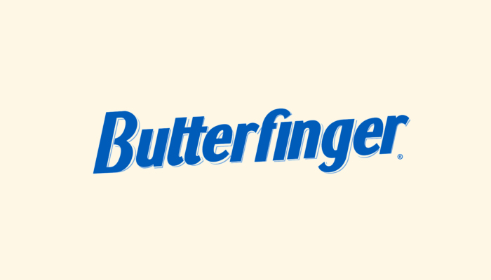
The logo is in blocky sans-serif font, which gives it a unique look. The bold blue color further strengthens the design’s identity. The letters’ creative visual hierarchy helps people remember the design.
Also, the letters have a slight forward tilt that indicates the company’s momentum and progress in its chocolate business. You can utilize a logo generator to access dozens of similar logo ideas for free. Or, you can hire a designer and provide Butterfinger logo idea as an example.
What’s unique about Butterfinger’s logo?
- Simplicity is constant, it never fails to attract attention.
- The blue color scheme represents the brand’s commitment to quality.
- The sans serif font used in the logo gives it a unique identity with a slight tilt.
12. Ferrero Rocher
Ferrero Rocher is an Italian chocolate-making company established in 1982. The company is known for its gold foil-wrapped spherical chocolates and outstanding brand logo.
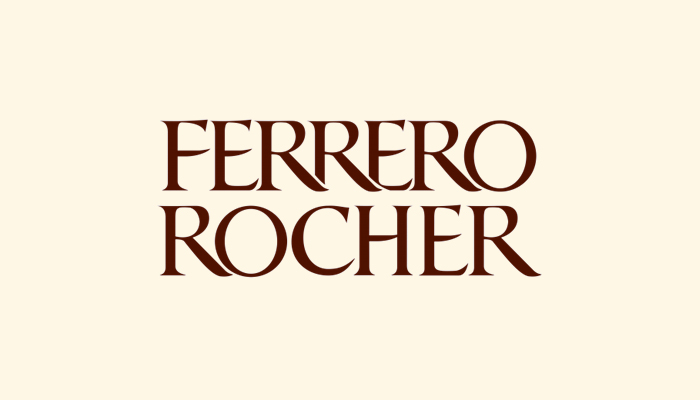
The Ferrero Rocher chocolate logo is an elegant design created in a stylish serif font. Serif fonts are known for giving a touch of sophistication, tradition, and luxury to their appearance. The logo looks unique due to the use of big serif letters. The compact look of the letters give the chocolate brand logo a solid and unified appearance.
What’s unique about Ferrero Rocher’s logo?
- The stylish serif font in a compact arrangement symbolizes the brand’s tradition, luxury, and unified appearance.
- The brown color depicts the company’s premium chocolates.
- Simple design makes the logo memorable and unique.
13. La Maison du Chocolat
The La Maison Du Chocolate is a reputed French brand famous for flavorful truffles, pralines, and ganaches. Its logo is an inspirational classic design.
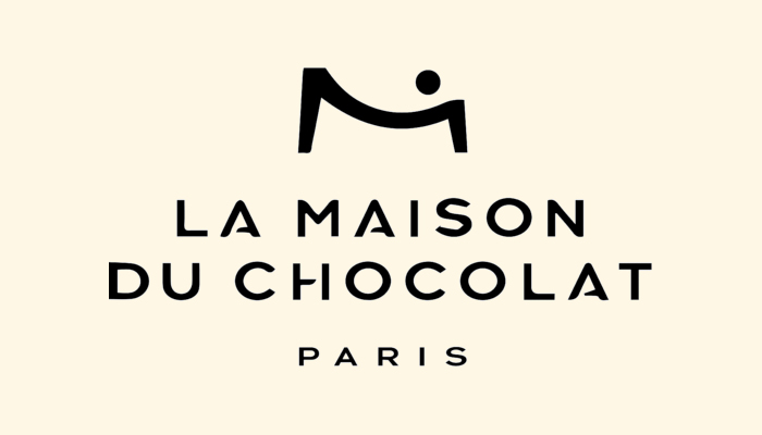
The modern sans serif font symbolizes the Parisian sophistication. The logo features an “M” letter at the top that either stands for a person or the chocolate bar. The spacing between the letters gives the logo a unique identity.
What’s unique about La Maison Du Chocolate logo?
-
The unique “M” letter appearing at the top resembles a person or a chocolate bar.
- The black color scheme shows brand authority.
- The modern sans serif font has a Parisian effect which makes it look elegant.
14. Merci
Merci is a German chocolate brand famous for its individually wrapped European chocolates. Its chocolate is often used to express gratitude, and so it has become synonymous with appreciation and gifting.
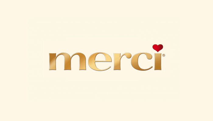
The Merci logo uses a lowercase typeface to convey the brand’s friendliness. The golden color and a heart shape in red over “I” represent luxury. Merci is a French word that translates to “thank you.” That is why the heart symbol sits at the top of the letter at the end.
What’s unique about merci logo?
- The logo is simple and easy to remember.
- The golden color used in the logo stands for its premium chocolates.
- The heart shape at the end signifies gratitude.
15. Scharffen Berger
The American chocolate maker is known for its high-quality chocolates that undergo a bean-to-bar technique. Its logo signifies heritage and legacy. The logo design is simple and features a circular layout. The company name is in bold sans-serif font that clearly states it authority.
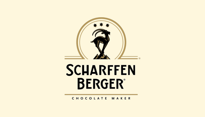
The goat standing on the mountain peak in the circular layout with three stars at the top shows excellence. The black and gold color palette exudes luxuriousness. The “chocolate maker” just after its name stands for its artisanal focus.
What’s unique about Scharffen Berger’s logo?
- The logo’s black and gold color scheme represents luxury chocolates and the brand’s authority in the market.
- The goat with three stars in a circular layout indicates excellence.
- The sans-serif typeface beautifully depicts its heritage, class, and modernity.
So, these are the top chocolate brands’ inspirational logos. Take ideas and inspiration from them to create a relevant logo for your chocolate brand. But do not copy them. Instead, these logos should serve you as inspirational designs. Learn what colors and fonts make them unique, and then consider the right one for your brand.
You can also get help from a logo generator, an AI-based software. It will generate dozens of logo ideas based on your inputs, such as your company name, tagline, colors, fonts, symbols, etc. Then, pick your idea and customize it further into a unique logo design as your brand identity.
Wrapping Up
Chocolate brands have unique names, and their logos are remarkable designs. Their use of colors, fonts, symbols, and typography makes them look distinctive from their competitors in their niche markets. These top chocolate brands are great examples of logos that we can instantly identify. We associate these logos with the great quality of their brands’ sweet treats and offerings.


